Environmental design–signage–is all about the need for your information to be clear.
It happens through the legibility of text, proper contrast to the design elements, color awareness and the respect of the fabrication process. Start with good design, pay for the right fabrication; it is your name up there. It informs, sells or introduces you 24-7.
If you are interested in visual quality and have a companion need to make an impactful visual impression, contact me.
The clients and fabricators I have been able to work with always make this part of the design process interesting, challenging and not inexpensive.
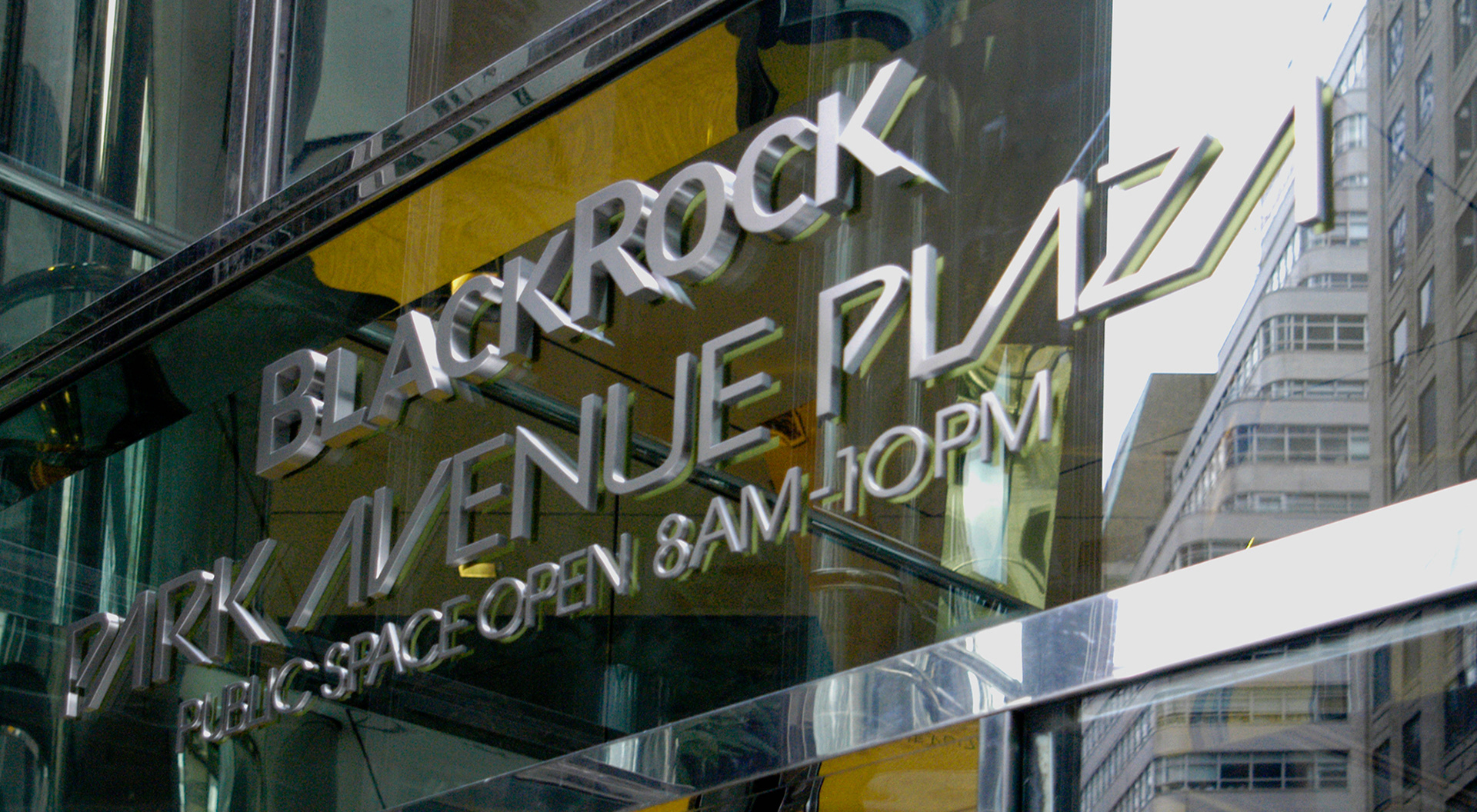
BlackRock needed a set of wordmark characters on this building in New York City. The original architect's plans revealed a font that was to accompany BlackRock's name, but no digital files existed. I was able to identify Avant Garde with alternate characters. The building has landmark status so the need to tread lightly and not mess with history–Herb Lubalin and Tom Carnase designed Avant Garde in the late sixties–made this a very thoughtful project.
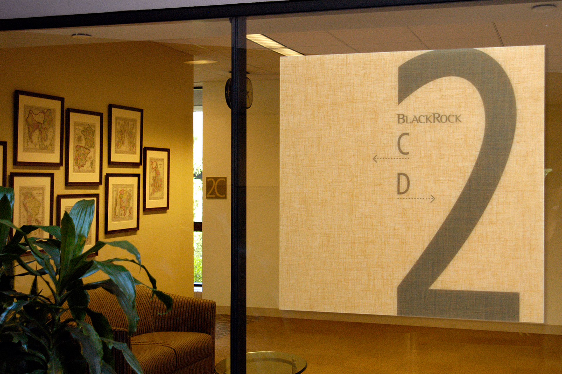
BlackRock merged one of their financial arms with another entity and inherited a vast campus in New Jersey. The need for wayfinding was driven by the size of the place, it seemed to me more like an airport than office space. The interiors firm handling the design integration of the merged offices asked for a set of signage designations tied to distinct colorways. We used the BlackRock standard of Frutiger for the information and the 3form panels had a matching hue of film sandwiched within the layers.
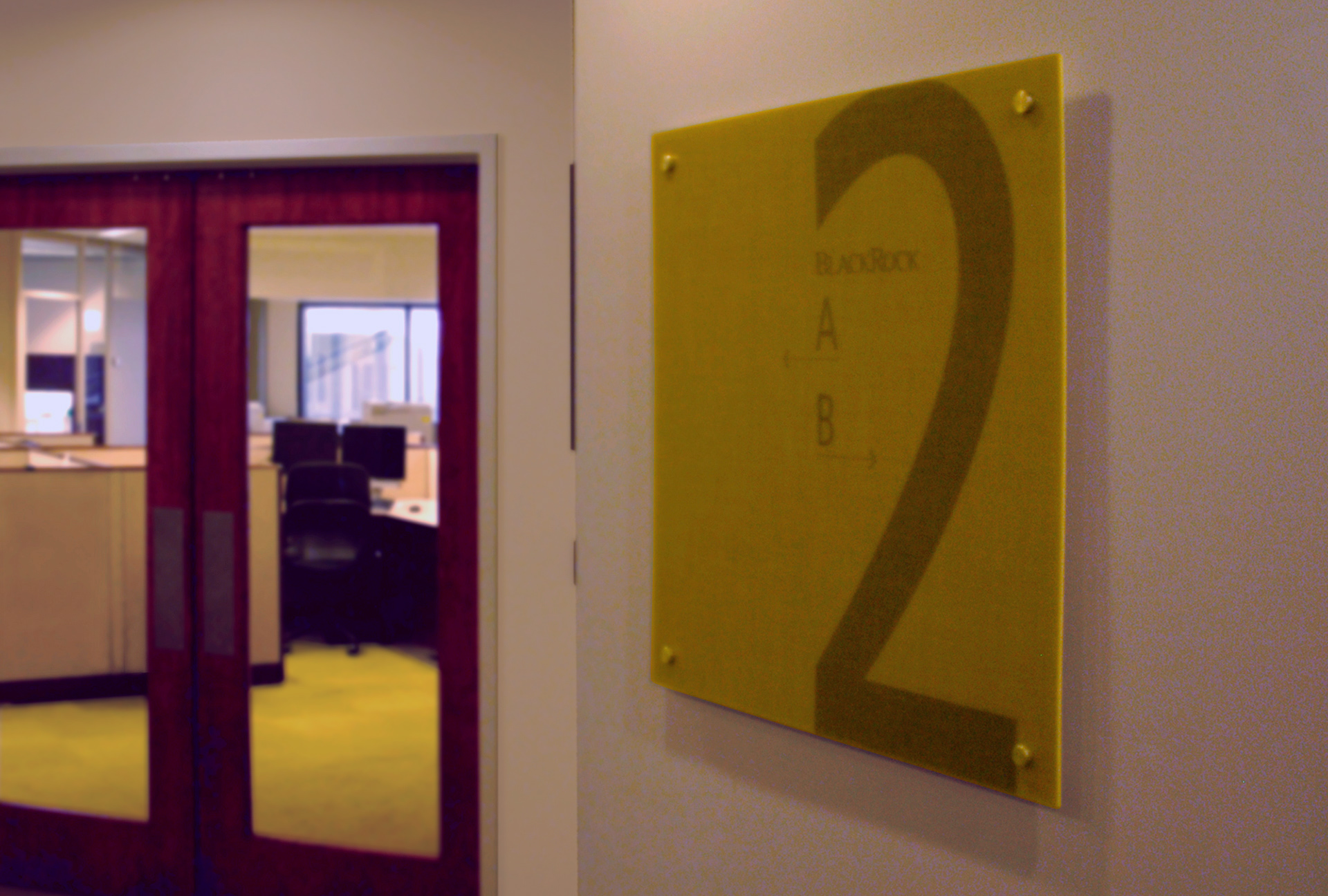
Working with the interior architect, the larger 3form panels were pin mounted to emphasize the information plane with color associations tied to the corresponding department.
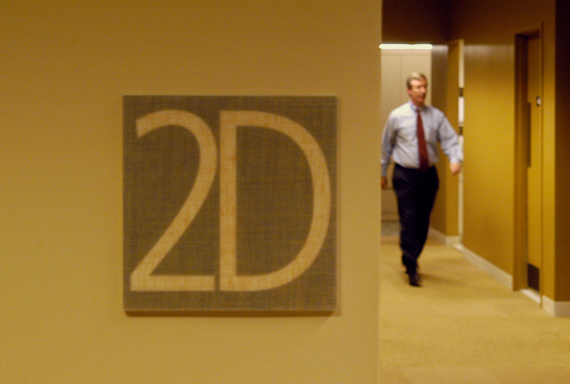
More of the 3form panels to indicate location of department pods within the large footprint of this BlackRock campus. The sandwiched number / letter combinations had a more discrete feel and were color-coded to carpets and paints used by the interior architect.
Another of the 3form panels used at the BlackRock NJ campus. The relative lightness of the material with the scale of the wayfinding message allowed a distinct mount to interior glass at an exterior exit. The corresponding information was mirrored on an identical panel on the inside surface of the small seating area.
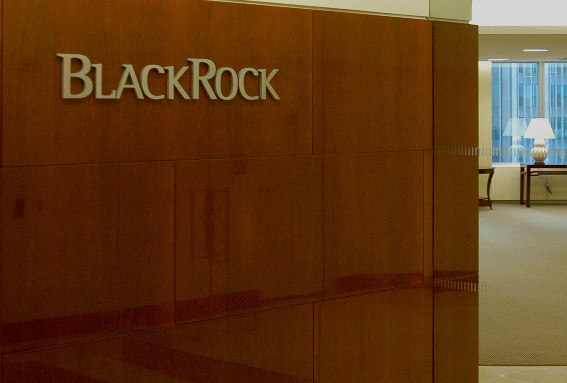
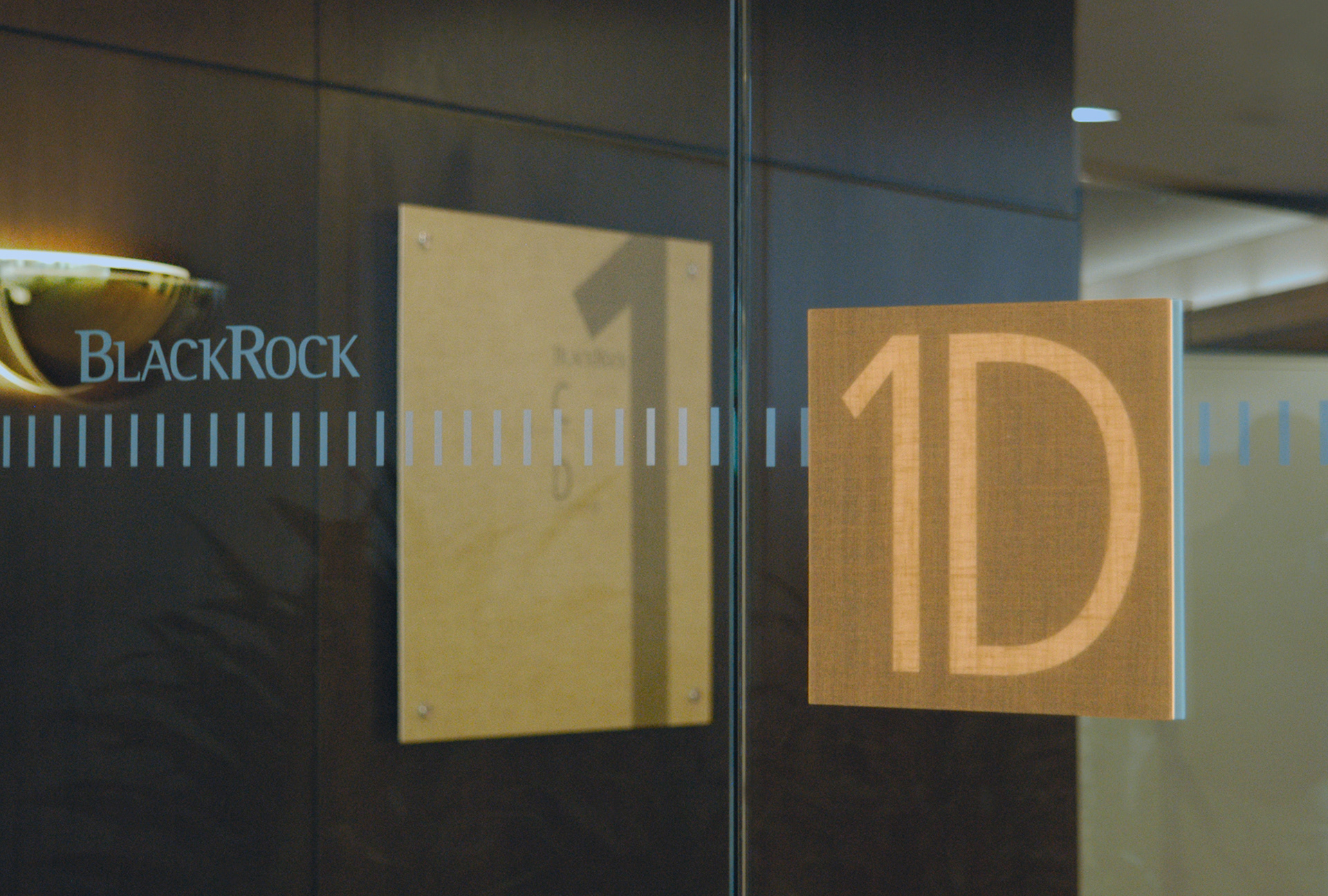
BlackRock identity signage in an elevator lobby in New York City, looking into a reception area. The letterforms used in these applications were typically solid: brushed stainless steel with a pin mount. The effect gave a little visual softening and a slight cast shadow.
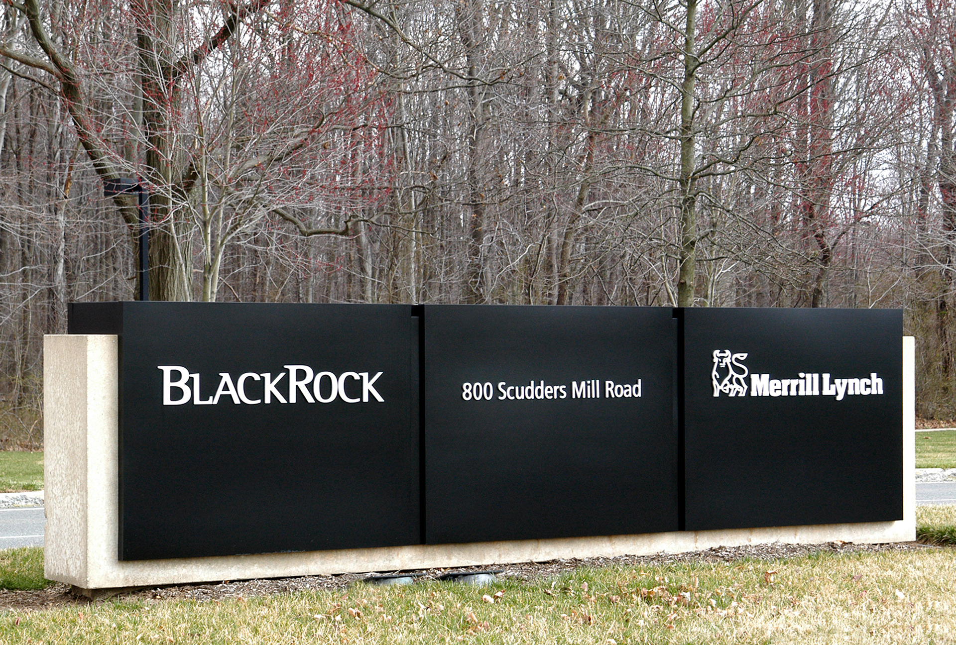
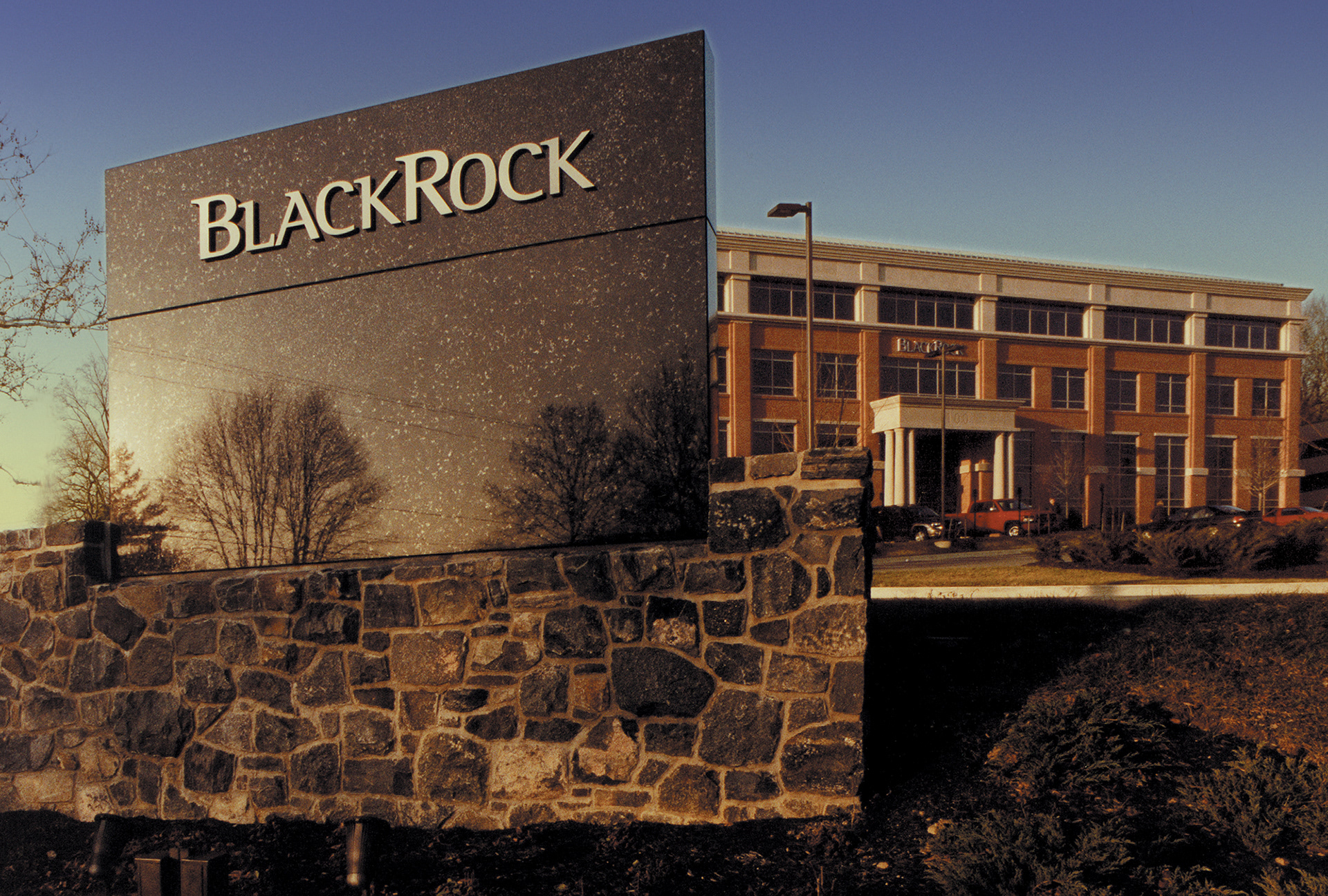
BlackRock's NJ property included monument naming rights for this site. The concept was to cap the existing signage with this metal device. Compass Signs of Bensalem, PA fabricated the boxing structure, covered it with an aircraft grade paint to resist fading and pin mounted the visuals.
BlackRock, when it was part of PNC Financial, used a typeface called Rotis Semi-Serif. They have since changed all their word marks to a more simplified Sans. This monument used pin mounted brushed stainless steel characters. The installer had bit of a time when drilling into this black granite, I think he went through a dozen bits…
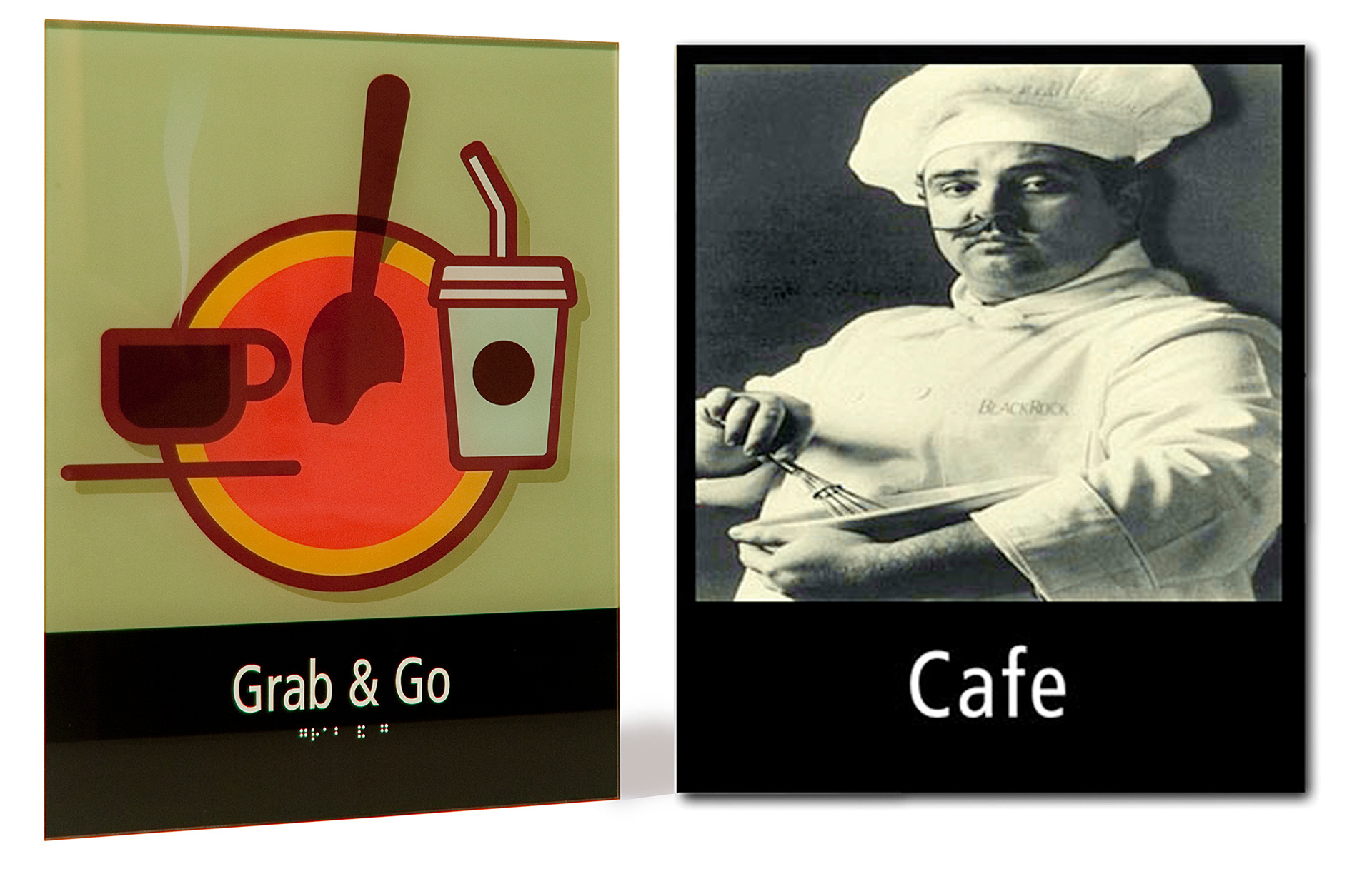
BlackRock asked for some more whimsical visuals for in-house eating options. The Grab & Go was reverse printed on an acrylic panel with surface mounted ADA complaint type and Braille. The Cafe sign was fabricated using fired porcelain from Winsor-Fireform for a timeless look.
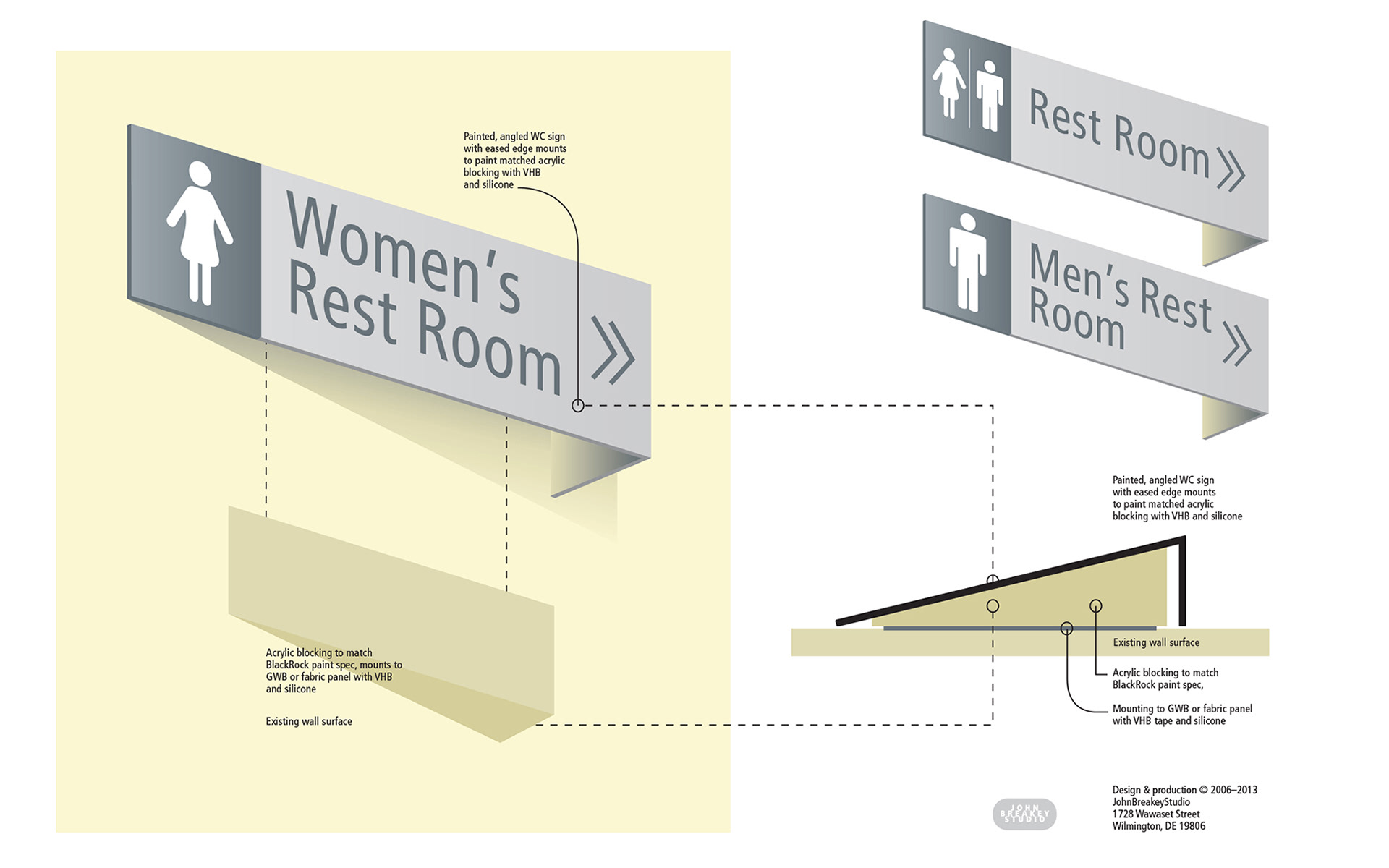
BlackRock needed a solution for something as simple but necessary as a clear and fast read on WC locations. Not wanting to have a ninety degree flag bisecting lines of sight, I designed this. The symbols and icon development for BlackRock was all unique to them. Frutiger is the principle typeface used throughout this system.
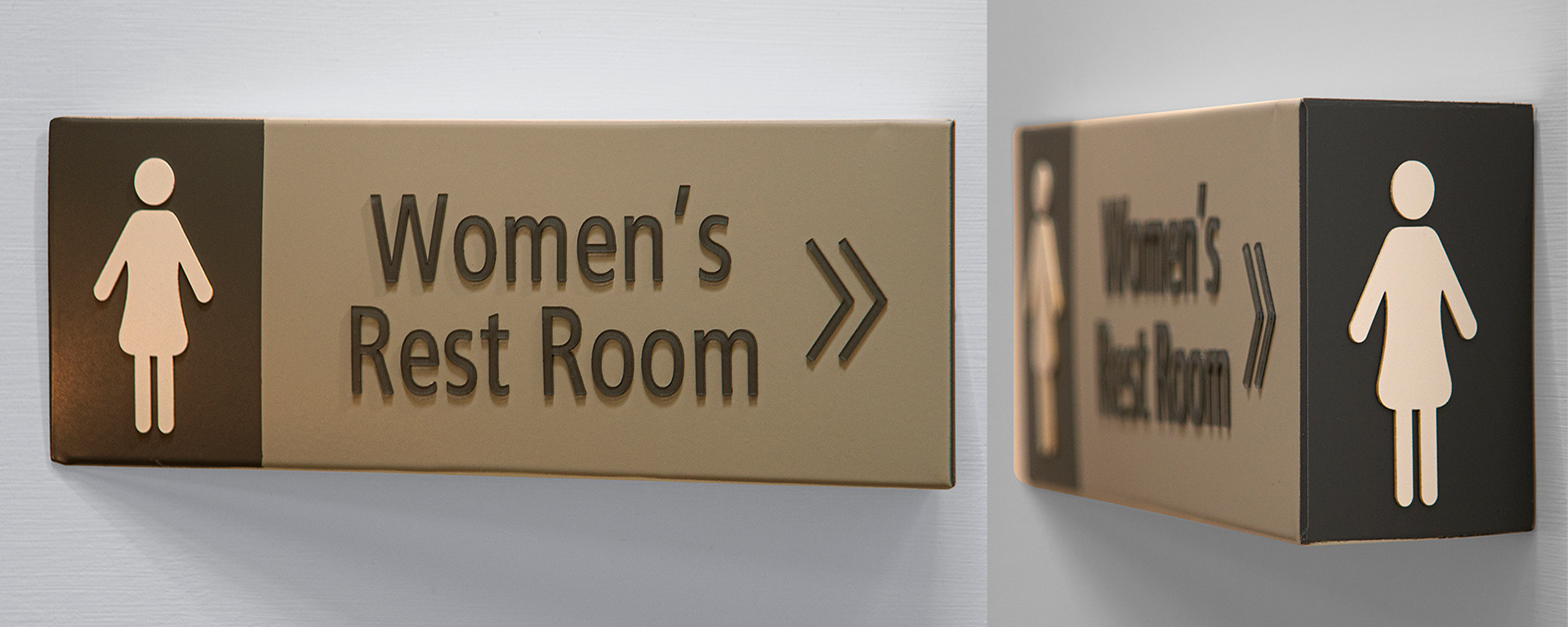
Here are a couple of views of the finished, fabricated sign, albeit photographed in my studio and not on the wall at the site. I know it is just a WC sign but small details matter and all the signage for this client made use of unique and proprietary icons for their facilities.
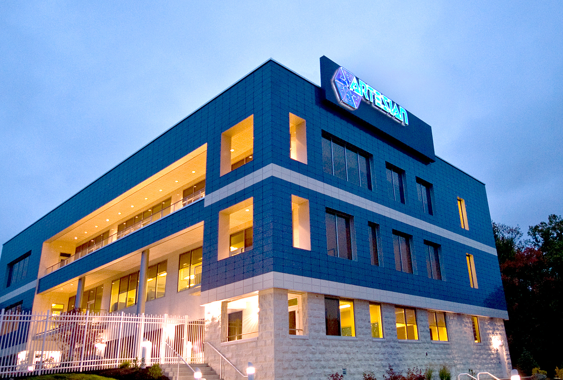
Artesian Water exterior and interior signage. The architect asked for display options, this idea was worked out as a device to bump the branding up just a little higher than the roofline, working as a visual shield of building equipment. Ed Cunicelli; photo
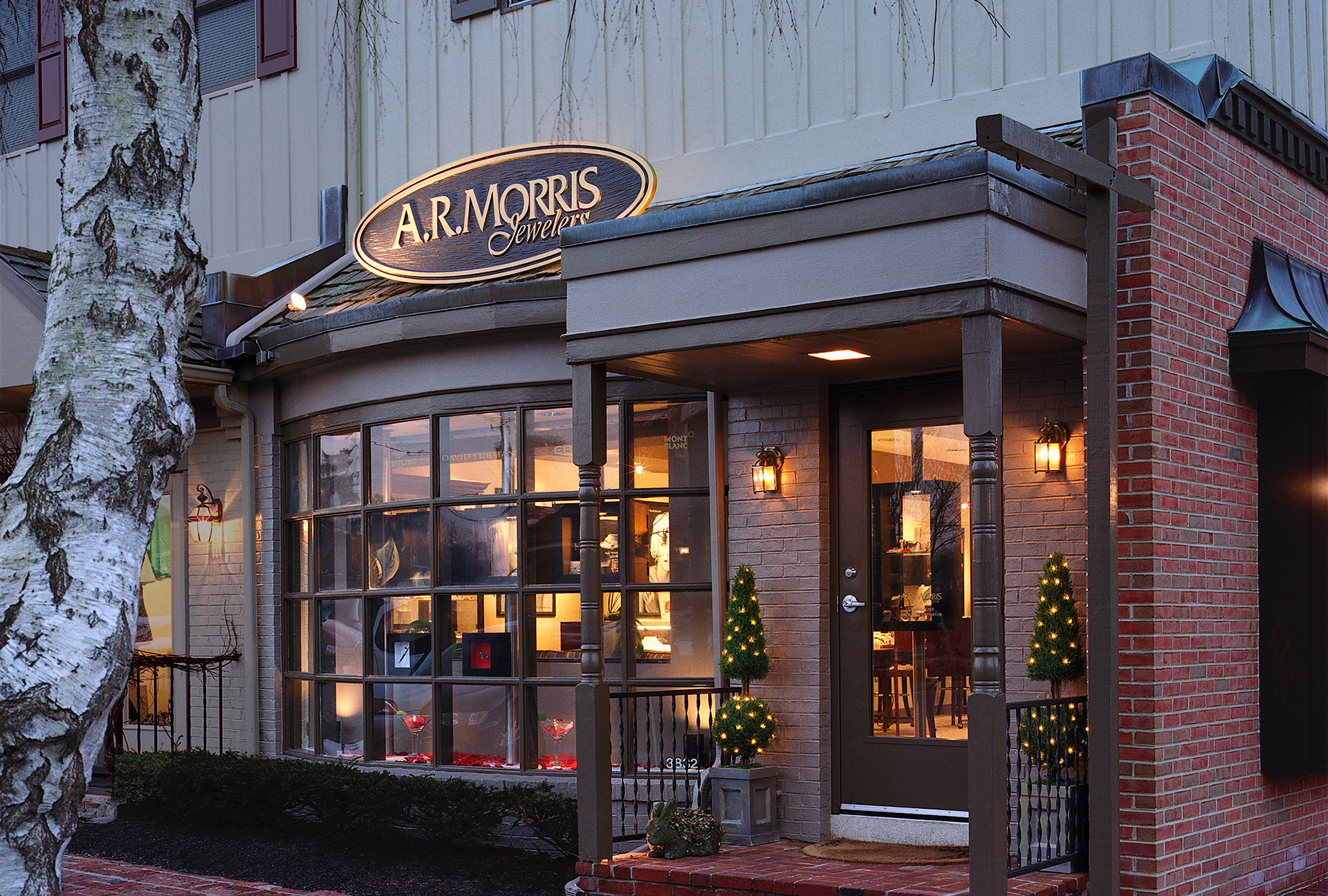
A.R. Morris is a local retail institution. Exterior signage had to comply with other small stores in the cluster of this shopping center standard; the client's word mark had to fit well within an oval. Tom Crane; photo.
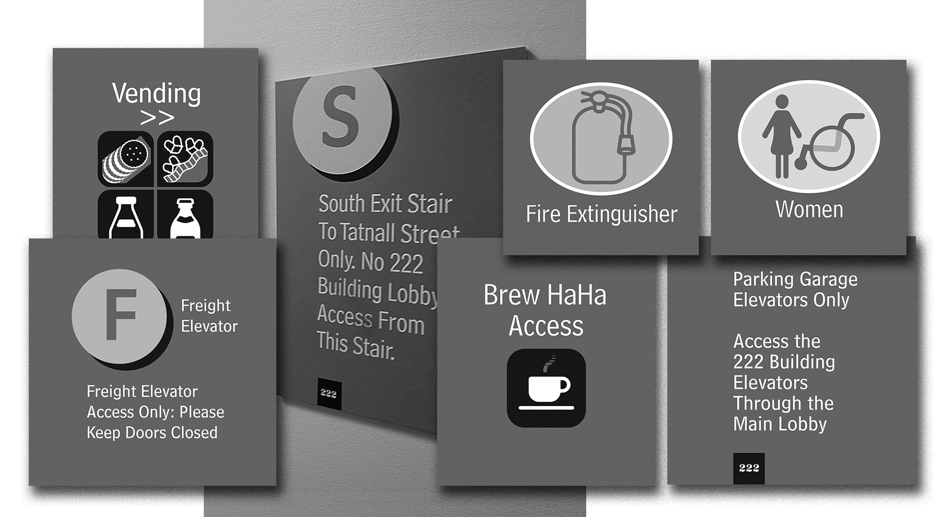
222 Delaware Avenue Signage design. Bell Centennial was the principle display font supporting the Frutiger text. The preexisting 222 characters were updated to knock out of a solid square and used where appropriate. Precision Signs of Amityville, NY fabricated the various materials used.
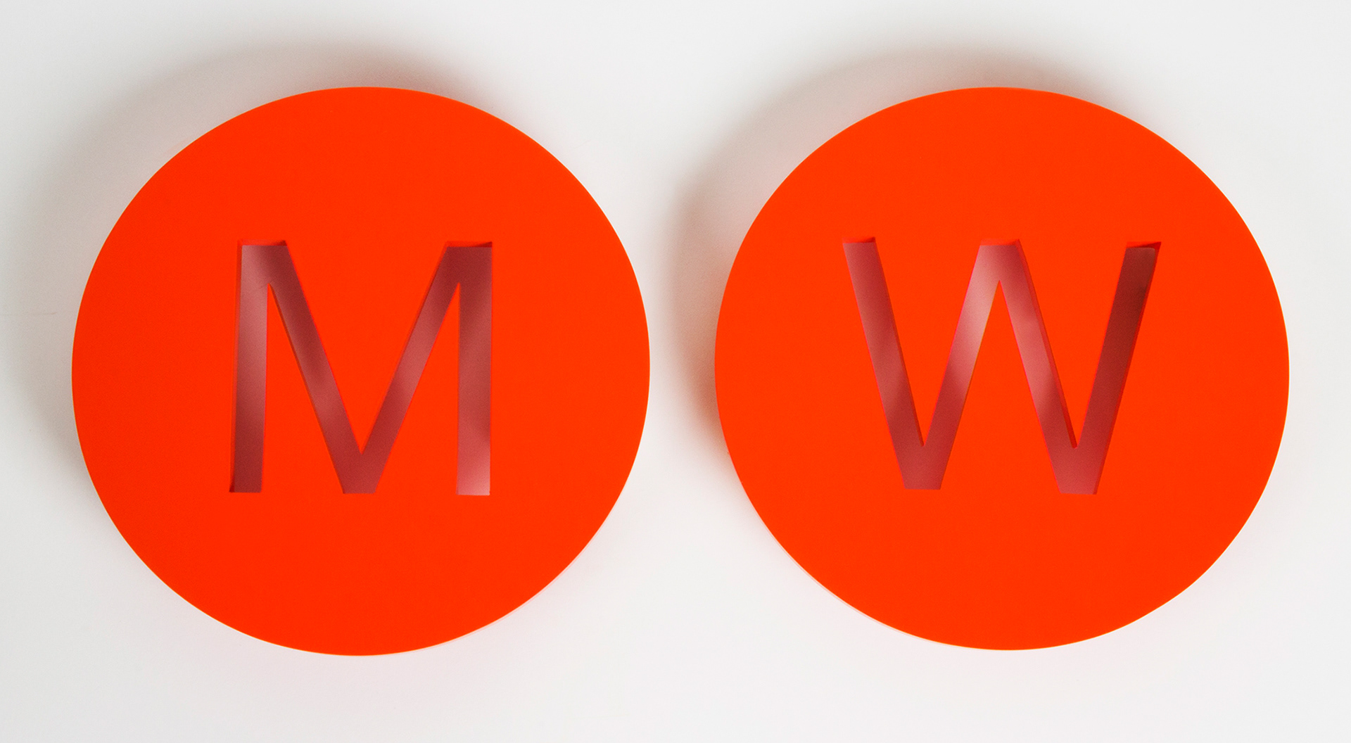
A local Knoll dealer needed a distinct WC set for their showroom; the stipulation was simplicity.
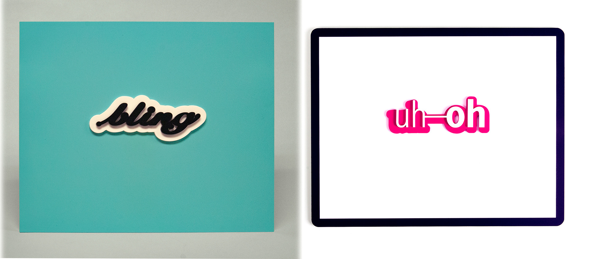
Bling is hand drawn using the Pen tool and layered with laser cut acrylic on a painted acrylic base.It is the only one fabricated of it's kind and it is for sale at $650.00 plus insured shipping.
uh-oh is fabricated type-as-outlines painted match 100% magenta and mounted on white on black painted acrylic panels. Produced as a series of six, there are two left for sale. I'm keeping one so that means there is one left, priced at $450.00 plus insured shipping.