
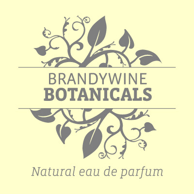
Floral vines and typographic forms in combination for a company making fragrance the natural way.
The project included identity design, application to packaging, web development and stationary.
Solutions were created through series of typographic reviews to find the "right" look for the text; it's use at very small sizes on bottles required a modern, digital family with tall x-heights and a good variety of weights.
Vista Sans and Slab by Xavier Dupre fit the bill nicely.
The floral vines were inspired by turn-of-the-century woodcuts. Extensive pen tool work added the right amount of detail while striving for a simple, clean approach as expressed by the company's founder. Since the parfum and fragrance combinations were all created by hand, the visuals had to support the essence of elegance and clarity…
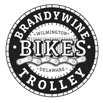
When two different local cycling shops, both with an established brand changed hands, the new owners approached the studio with the need to combine both under a common visual.
This mark seen here is the most graphic and direct of the extensive set getting a fresh visual treatment. Spaceboy of Wilmington, who silkscreens for this client, needed a version that could replicate the gradient tones used in the print and web versions of marks.
Variations can be seen on the identity development page of this site and the graphic process to each end.
Digital design makes variety possible. So does riding many, many miles on a bike. The amount of chains I've cleaned and lubed gave me a special appreciation for getting the links to look right. Almost as much as finding, and using a good, strong slab font that "spoke" well.
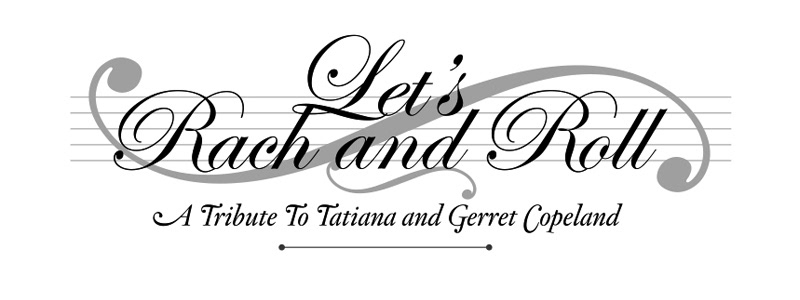
A mark for a commemorative event in honor of a couple who have given extensively to the arts. The design was followed by a 48 page program guide for the night of the event. A cover image illustrating the editorial thrust of the design can be seen on the Marketing and Communications page of the site.
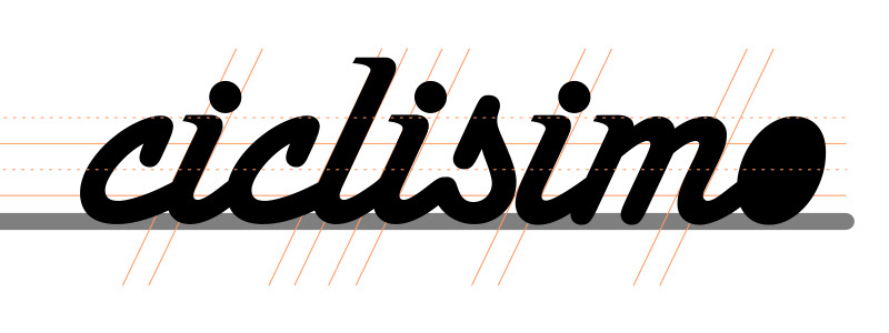
A mark for a cycling jersey design that went down another road. I show it here in the hopes that someone will see it and ask me to apply the forward motion and classic script to a project…
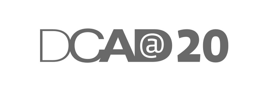
The Delaware College of Art and Design recently celebrated 20 years of doing the amazing things this small, smart school does: give students a real glimpse of the creative life and how it can become a career. Michael Gunselman used the Univers family when he created this mark for the College. My job was to showcase the years but stay out of the way of his wordmark.

Bodoni is thought of in typographic circles as a Modern classification of letters. To make such a pronounced thick and thin combination in the late 1700s spoke to Giambattista Bodoni's genius. Using it here for a highly networked golf pro seemed the right font for a classic game.
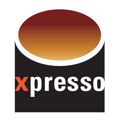
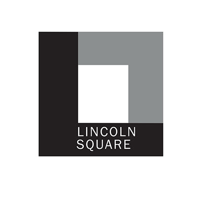
Two that got away. This is common in designing marks for start-ups and established entities. The goal of the mark for Lincoln Square was application as signage and to honor the building's history of a former President speaking there. The mark for the coffee bar was a response to an open call for an identity, which I rarely do. The lure of a coffee mark was as great as the need for every morning's expresso…
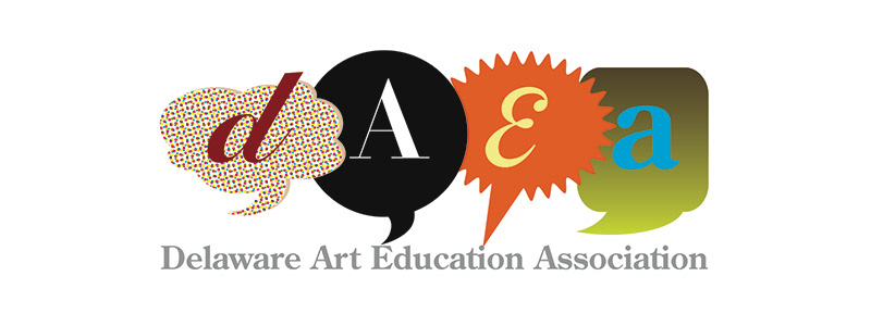
The mark's name says it all. It was my honor to make a collection of letters that carried the many different approaches to teaching art in schools. If you know an art teacher somewhere, go say thank you: making art is hard, herding kids making art is really hard.