
When you look at the great sculptors who made modern works, one cannot help but see the DNA of those minimalist forms in today's marks and logos. Constantin Brancusi, Isamu Noguchi and Jean Arp simplified life's complexities into concise expression. Identity for a company, large or small, has to coalesce into a visual statement, clear and immediate. It takes a designer who can listen, be disciplined about all the possibilities and then earn the trust of the client.
Simple is not so simple.
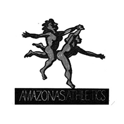
A client came with an idea for a clothing line based on strong athletic women wearing workout gear that was equally robust. And, since they were from South America, the Amazon aspect held no baggage for the client, indeed they embraced it. Initial conversation can lead to a project and fee schedule.
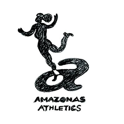
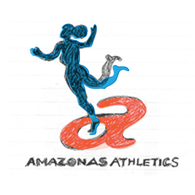
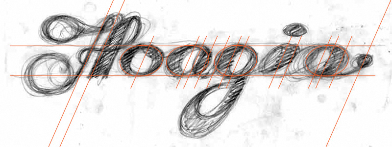
When I receive a go-ahead, I usually put pencil to paper and come up with small drawings. The second image above happened because I have had a postcard of Picasso's Two Women Running on the Beach adjacent my work area… The last image represents the scanned drawing, the colored vector shapes were indicative of the development at the time.
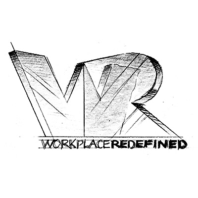
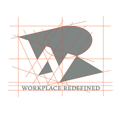
Workplace Redefined also started as a series of drawings. When marks develop past the preliminary stage of ideation and a specific direction is chosen, the build begins in the software. Good marks are highly sculpted things and impart a sense of dimension and volume. Alignment
to a particular compositional grid gives a sense of certainty that the thing will sit well within the clearspace designated for it.
to a particular compositional grid gives a sense of certainty that the thing will sit well within the clearspace designated for it.
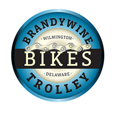
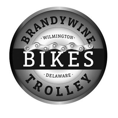
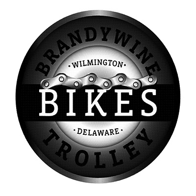
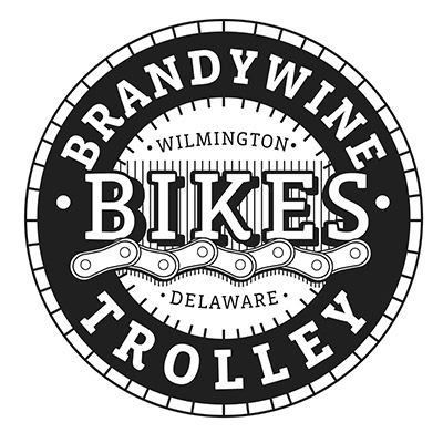
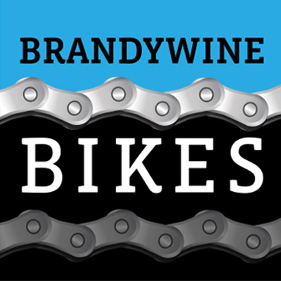
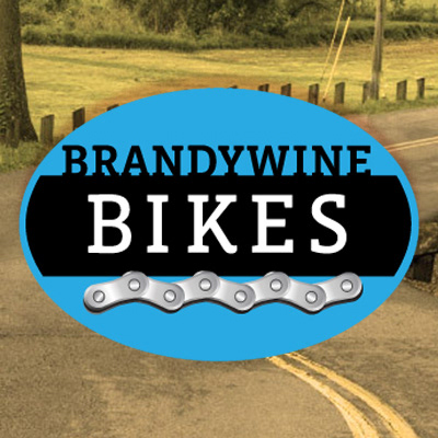
Brandywine and Trolley bikes were separate bike retailers here in Wilmington, Delaware. The client needed a system that could define them as different but convey that they were owned by one parent company. A system of about forty distinct pieces were created for print, signage and web application. A greyscale version was never envisioned–color is inexpensive these days–but for use on clothing, the mark needed a little simplification. See next.
Spaceboy in Wilmington does a very fine job of working with marks on any number of surfaces;
I think they can silkscreen on just about anything. They do require a file that can stand up to the requirements of their screen printing, though. Print images have their specific process; line art substitutes for gradated tone in silkscreen production.
I think they can silkscreen on just about anything. They do require a file that can stand up to the requirements of their screen printing, though. Print images have their specific process; line art substitutes for gradated tone in silkscreen production.
The chain links become the common, integral part of the Brandywine Bikes system. They keep the image set moving, just like a real bicycle.
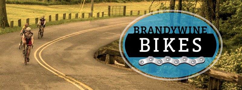
This is a the Brandywine Bikes identity replicated as a transparent PNG file used for social media.
The original, digital file of the oval's design was also used for signage fabrication at the shop here in Wilmington.
The original, digital file of the oval's design was also used for signage fabrication at the shop here in Wilmington.
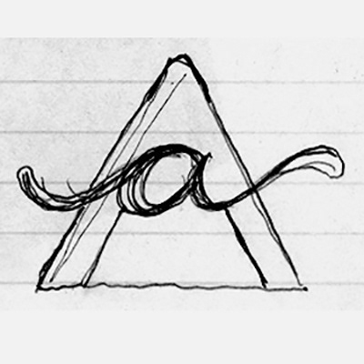
WIP: work in progress. The drawn letterforms will give way to extensive work with the vector's pen tool. The red lines represent my guides to keep everything consistent. Check back here later this summer (late July, 2020) to see the result.
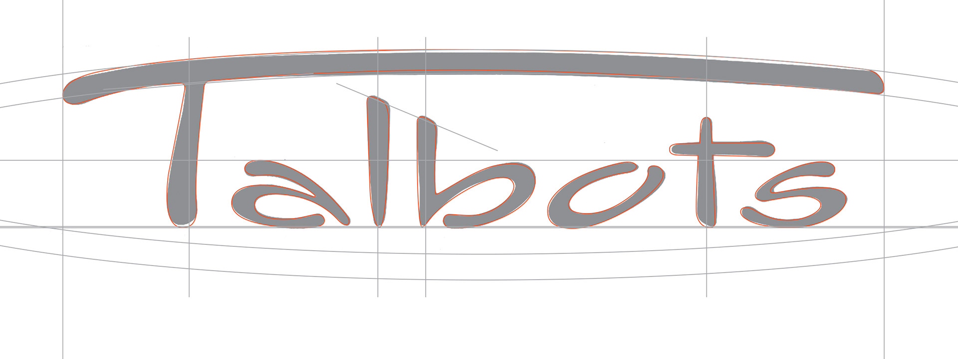
I drew the last script iteration of this wordmark for The Talbots; it was to be used on their first retail store on Madison Avenue in New York City. Suffice to say, it was a big pen and ink drawing, done with ships curves and emulsion cutting of the subsequent photostats to make the edges perfect. The dark grey represents a digital capture of the original mechanical; I always thought the top arc of the cap T looked a little clunky. When it came time to digitize it, the red lines you see represent the subtle alterations that happened within every evolving mark. People have often commented "oh, you did the Talbots logo" and I usually respond with "well, thank you. I worked on the one you see everywhere but no, I didn't invent it."