For a number of years I did graphic design, art direction and occasional illustration for the Delaware College of Art and Design. These are a few of the many things done over that time. Sadly the College closed in 2024, a couple of years after I left… If you are interested in creative services, see my contact info here on the site.
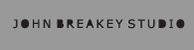
When DCAD's President suggested I help design material for an event to honor of Tatiana and Gerret Copeland, it was an immediate yes: the Copeland's have done so very much to support
the arts near and far. Working with Carla Markell and her very able team, DCAD's InQb8 designer, Shawn Hall and I put together the insides of the 48 page program for the night's event. McClafferty Printing laid down two hits of metallic gold on the invite and made the short-run program look like it was offset on a six color press. I assigned myself the cover art…
the arts near and far. Working with Carla Markell and her very able team, DCAD's InQb8 designer, Shawn Hall and I put together the insides of the 48 page program for the night's event. McClafferty Printing laid down two hits of metallic gold on the invite and made the short-run program look like it was offset on a six color press. I assigned myself the cover art…
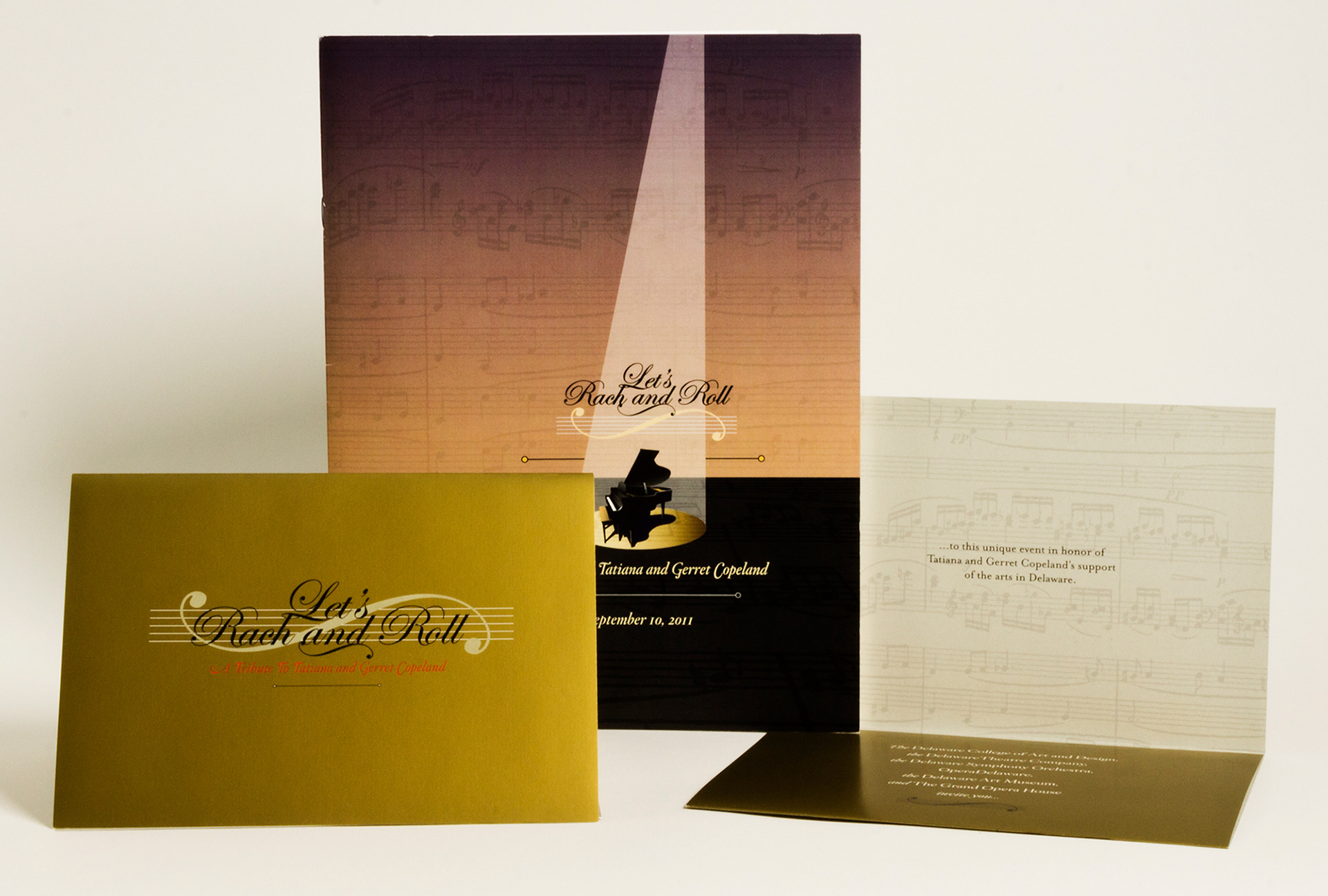
When Francisco Madera came onboard as DCAD's design intern, we tasked him to photograph color vibration studies from Foundation courses. I don't think he knew what he was in for when
he started this but where he ended up, as seen on the back cover here of the College view book, was pure visual delight. The cover image was one we had to push a little for: Kevin Lamara was assigned a self-portrait in his Foundation Drawing II course. He donned a blonde wig and captured himself on two pieces of taped together paper for a dramatic end result.
he started this but where he ended up, as seen on the back cover here of the College view book, was pure visual delight. The cover image was one we had to push a little for: Kevin Lamara was assigned a self-portrait in his Foundation Drawing II course. He donned a blonde wig and captured himself on two pieces of taped together paper for a dramatic end result.
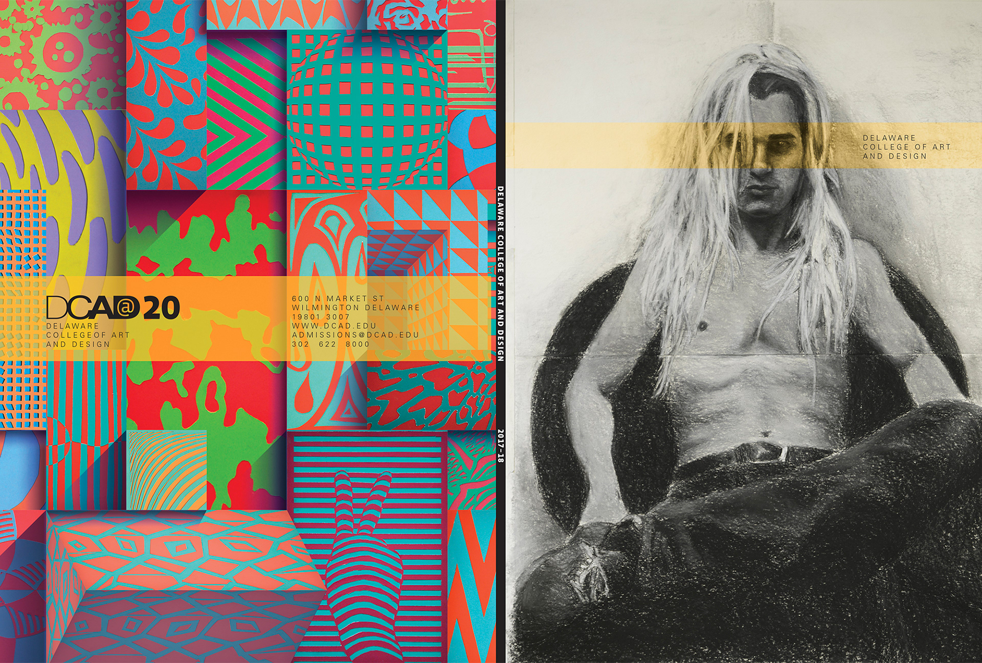
I always was very honored to design a postcard for DCAD's recurring show of faculty work. Never knew who came up with that title, it just existed from before my turn at designing. Reading the date on the design makes me realize how fast the academic years fly by.
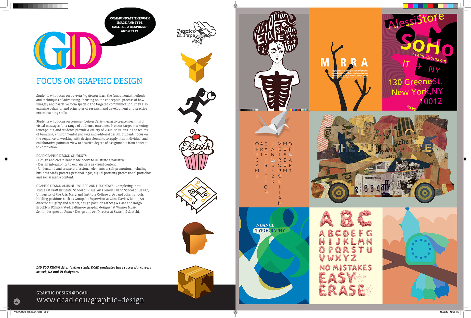
As the head of DCAD's Graphic Design program, it was pretty darn amazing to see the transformation of students into budding designers. Working with the Admissions team at the College, our in-house access allowed a nuanced feel for presenting the past and current work as a tool for recruitment. When students expressed thanks, I would usually sort of shrug and smile and say "you did all the work, I just helped you go a little 'tis way or that."
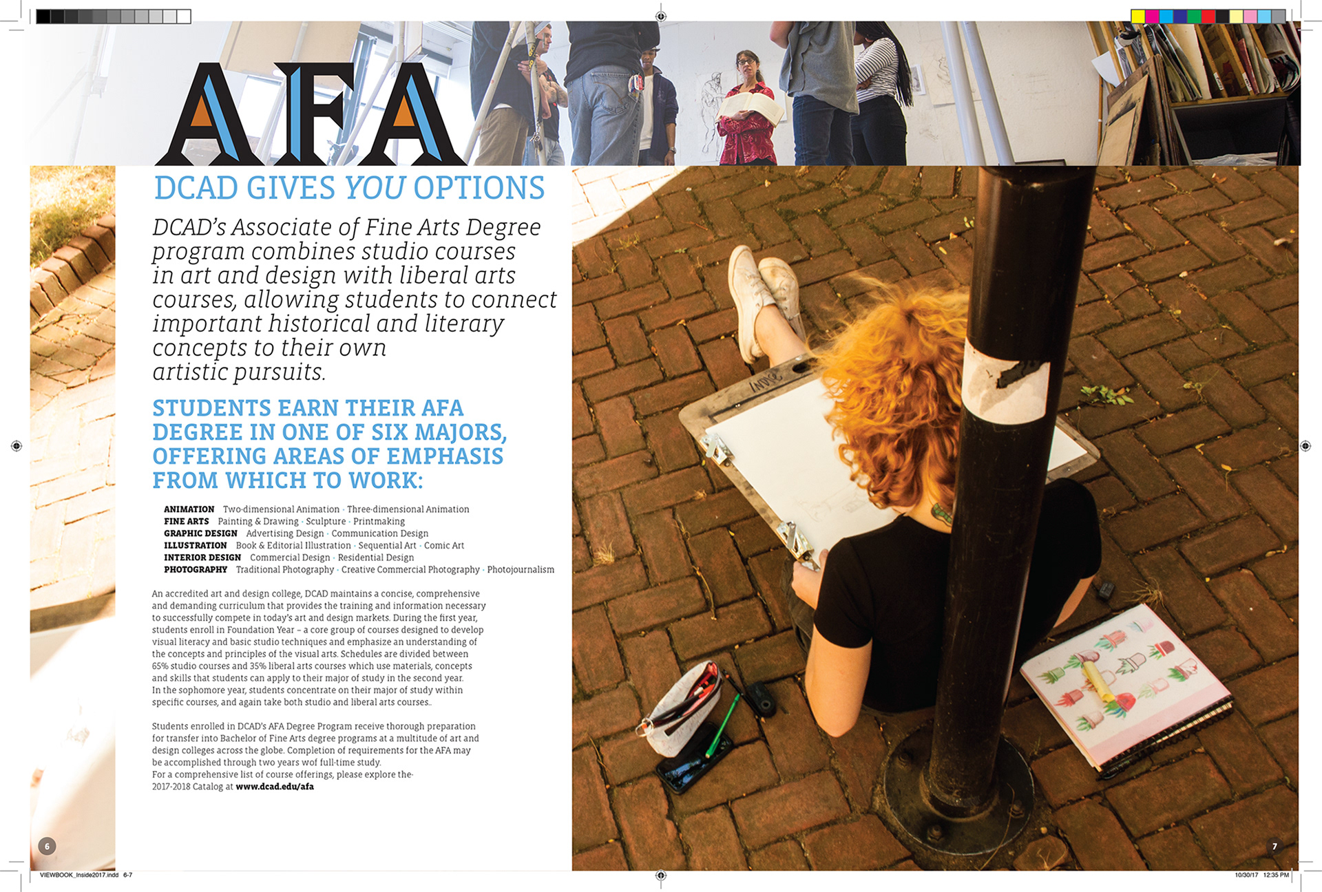
Another spread from the College view book. That's Indie Noel drawing outside in a photo from the versatile Francisco Madera. Catherine Drabkin was DCAD's head of Fine Art for some time, that's her in the studio, wearing red and offering likely a good thought about technique.
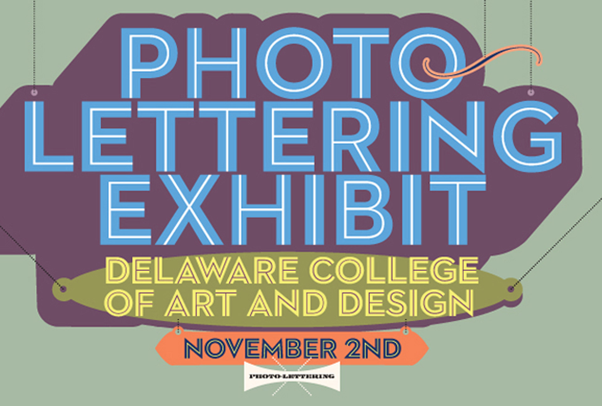
House Industries put on an amazing show of their PLINC archives and their type design process. In addition, they filled DCAD's Gallery space with beautiful and tasteful examples of design beyond just type. When the College rejected Bonde Prang's spot-on Spencerian design for a postcard mailing promoting the show, I sheepishly made this using their Neutraface Photo-Lettering display font. You should try it: photolettering.com
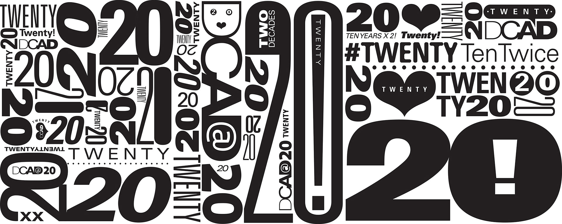
DCAD's Twentieth came and went but the white inkjet on clear vinyl still adorned the windows at the start of 2020, so the College left it in place. Probably best if it came down in December of 2023 and a new design takes its place. This image represents most of the image file. Precision Color Graphics of Wilmington printed and installed on the second surface of the lower part of the main Gallery windows wrapping around the Market Street to Sixth Street side.
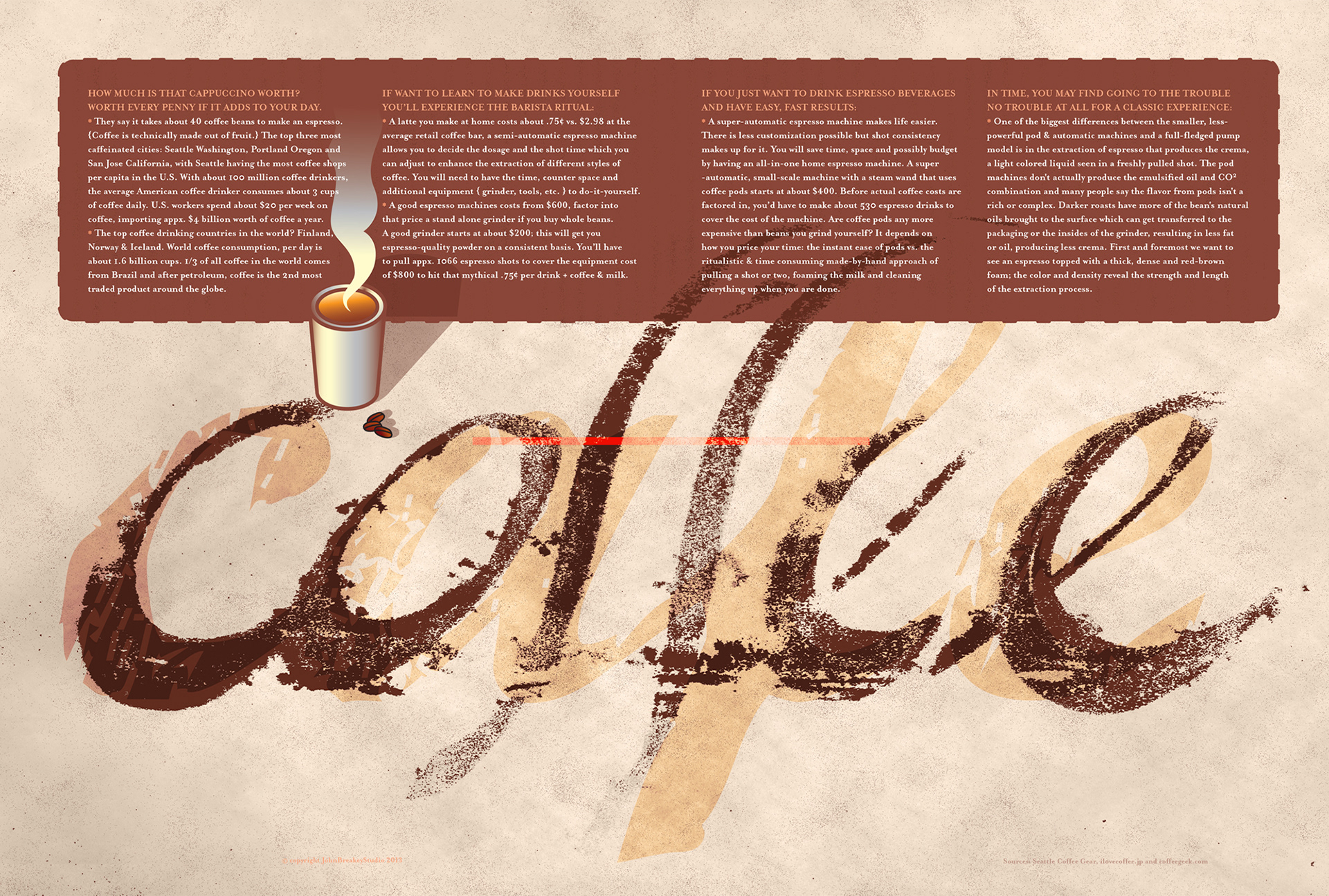
A project for an editorial colleague; the hand lettered coffee was done on newsprint, the ghosted cafe is a font and the coffee illustration is an Illustrator file; the entire thing assembled using InDesign with awareness of a gutter running down the middle of the spread.