


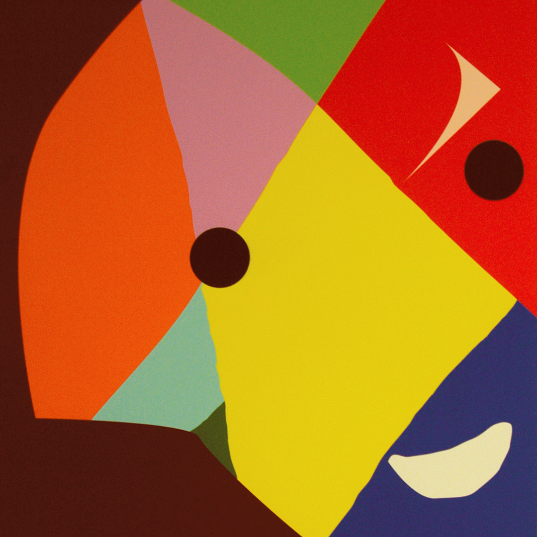

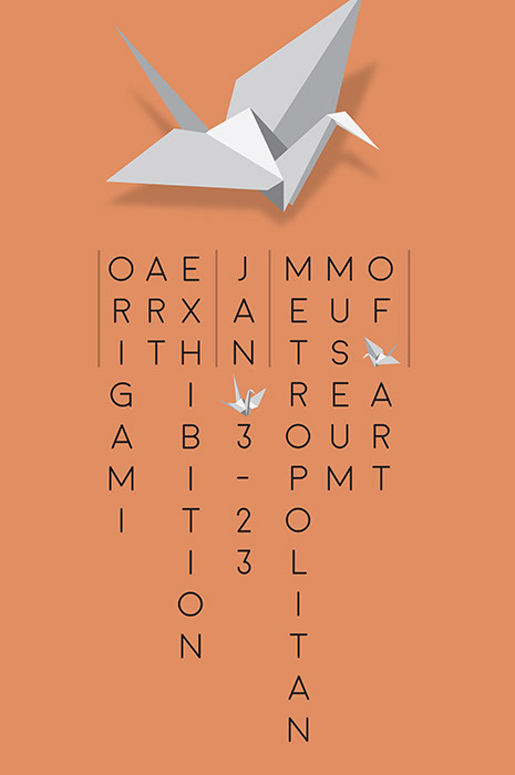
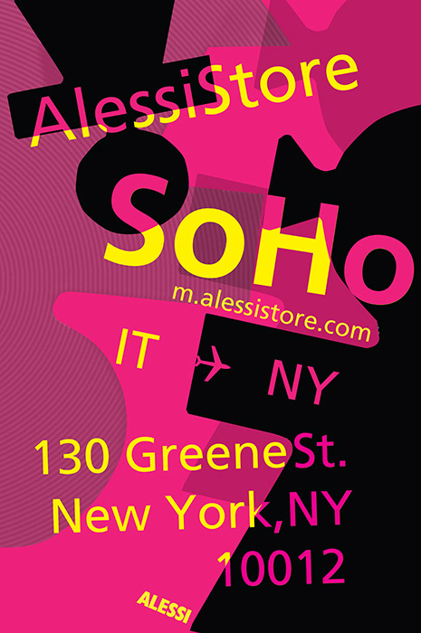
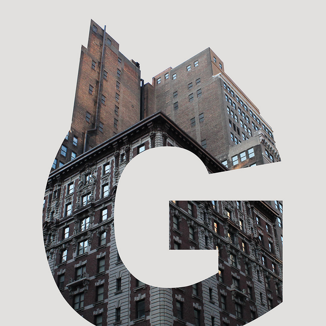
Anna is an icon from the Italian housewares company Alessi. These images represent student takes on working with this image in design classes at DCAD. From left: Andrea Hawn, Brea Mason, Chelsea Heitzman, Hillary Ciancossi, Jay Jang and Katherine Henshaw. All keyed in on the design by architect Alessandro Mendini who was inspired by a colleague, Anna Gill.

Erin Rothback 01

Erin Rothback 02

Erin Rothback 03

Erin Rothback 04

Erin Rothback 05
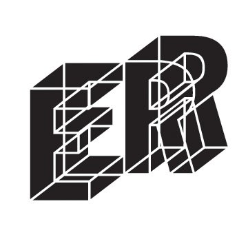
Erin Rothback 06
An Identity assignment for a course at DCAD, Visual Communication II. The prompt asks design students to match a typographic feel for their name. Tie their personality to the font's inherent shapes. Next, build a set of images that will help define you as representative as a visual in a personified way. Ms. Rothback examined a range–there were quite a number more than you see here–from her scientifically serious side to her playful one.

Nick Romano; Alessi

Katie Hinds, Alessi
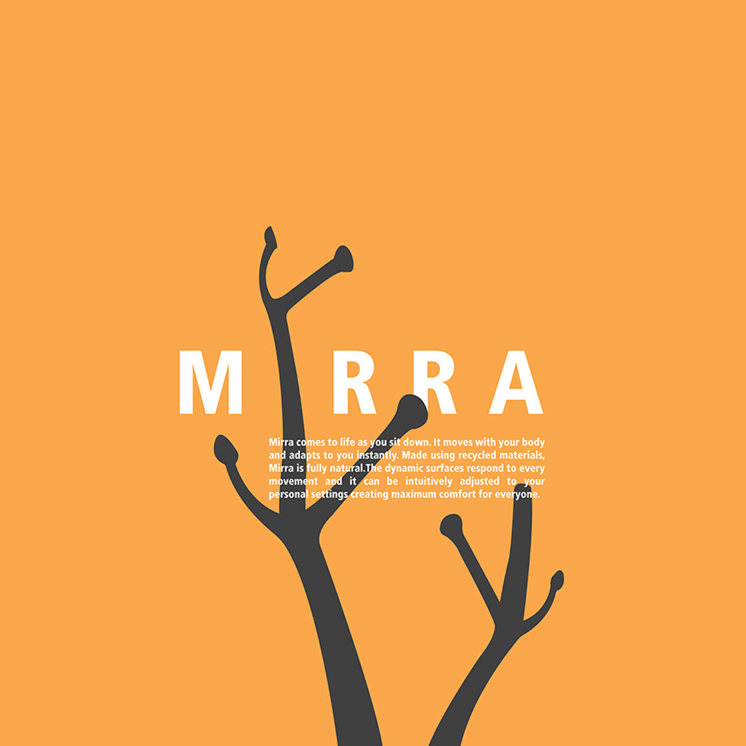
Anthony Hay, Mirra

Daejah Henry, Mast
June Kwon, Futura

Anthony Hay, Alessi
The Communication Design course at DCAD often sees the design students taking the original prompt and going to places unexpected. These six wholly successful solutions are strong enough to stand up to being cropped in a vigorous way. From left: Nick Romano, Katie Hinds, Anthony Hay, Daejah Henry, June Kwon and Anthony Hay again.
Mason Starkey
Olivia Kwiatkowski
Ryan Schilling
Will Ramirez
Kari Grauel
Noah Cimatu
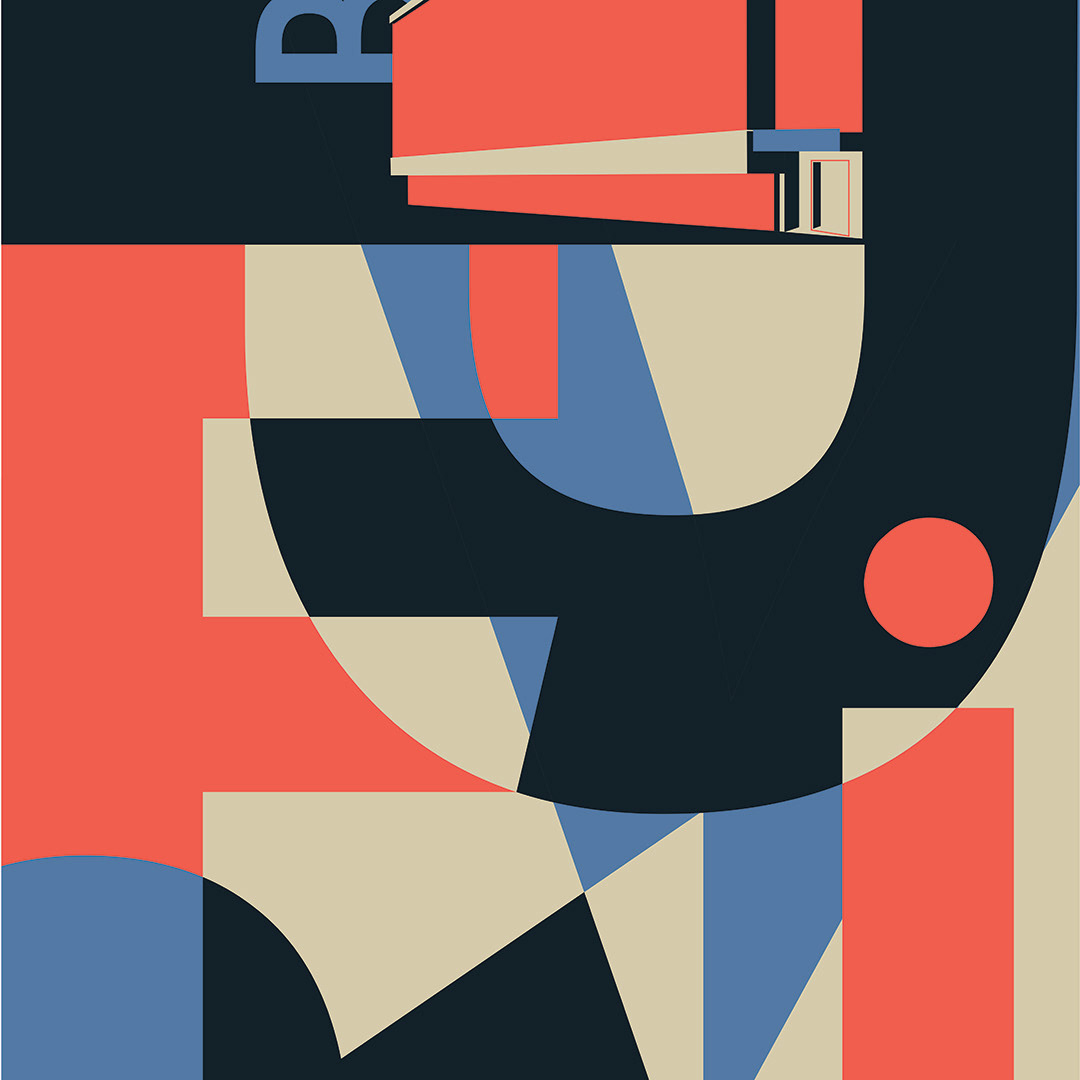
Project solutions adapted to a poster format for various DCAD graphic design courses used in various graduation exhibitions… From left, Mason Starkey, Olivia Kwiatkowski, Ryan Schilling, Will Ramirez, Kari Grauel, and Noah Cimatu.

Jackson Fleagle; UPS

Caleigh McGrath

Andrea Hawn; UPS

Kaitlyn Langshaw-Johnson

Andrea Hawn; DDD

Hannah Song

Alexis Peabody

Samatha Ruppersberger

Kendra Dingley; UPS

Lindsey Begquist

Nick Romano

Samantha Silva
Icon design, corporate identity system, branding, wordmark, logotype… Our graphic design majors work within different classes to create strong, concise and clear visual symbolism. Effective marks must distill complex metaphorical ideas and statements into immediate recognition. That's what we teach at DCAD. From left, row one: Jackson Fleagle, Caleigh McGrath, Andrea Hawn and Kaitlyn Langshaw. Row two, from left, Andrea Hawn, Hannah Song, Alexis Peabody and Samantha Ruppersberger. Last row from left, Kendra Dingley, Lindsey Brergquist, Nick Romano and Samatha Silva.
Paige Flowers
James Tsiatis
Crista Bickhart
Nathalie Gomez
Monique Sheldon
Erin Kelly
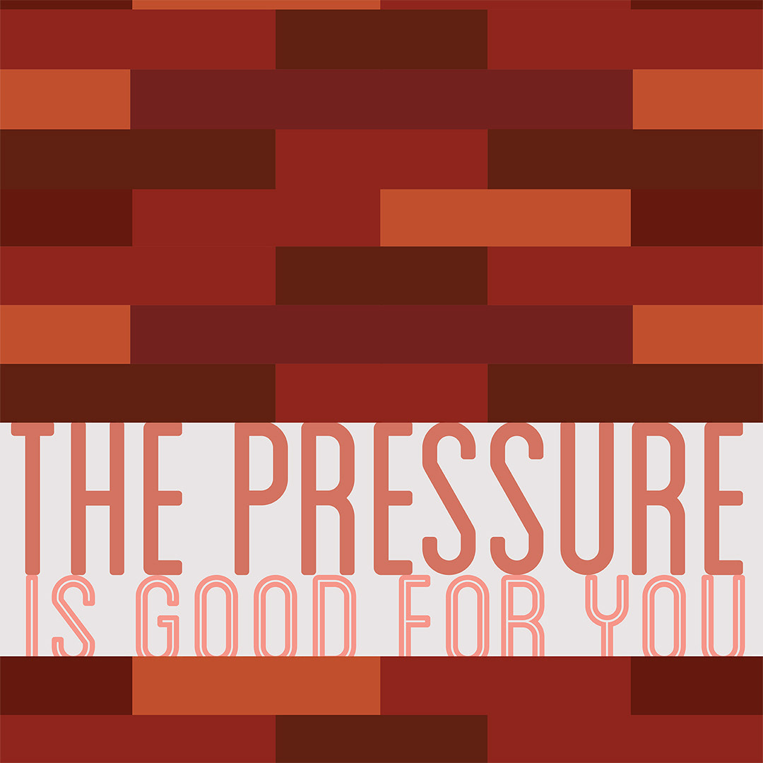
Examples from Typography I and II courses at DCAD. We ask the students to think about type as letter, word, line, paragraph and page when working with it. Type is an artistic element, to be sure, but they must learn to be very respectful of the viewer, the L word: legibility. It takes a couple of semesters but they become aware of the visual power of words to be so much more than a font choice in a pull down menu. From left: Paige Flowers, James Tsiatis, Crista Bickhart, Nathalie Gomez, Monique Sheldon and Erin Kelly.
Brianna Repella
Cullen Mancuso

Davina Johnson
Emily Crites

Knotts King
Samantha Silva
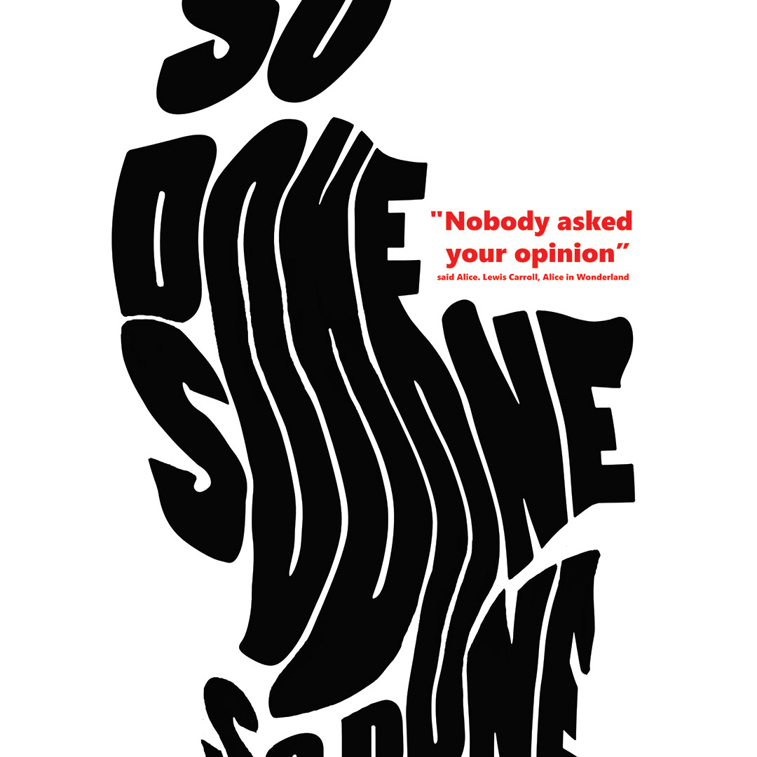
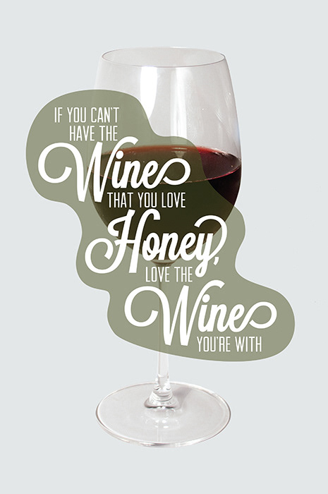
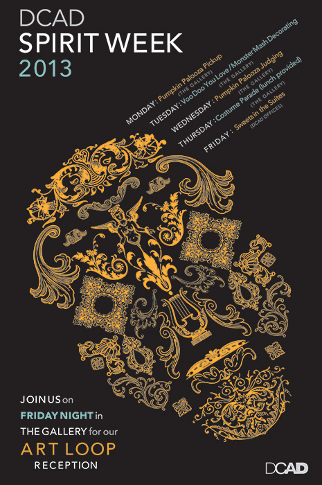
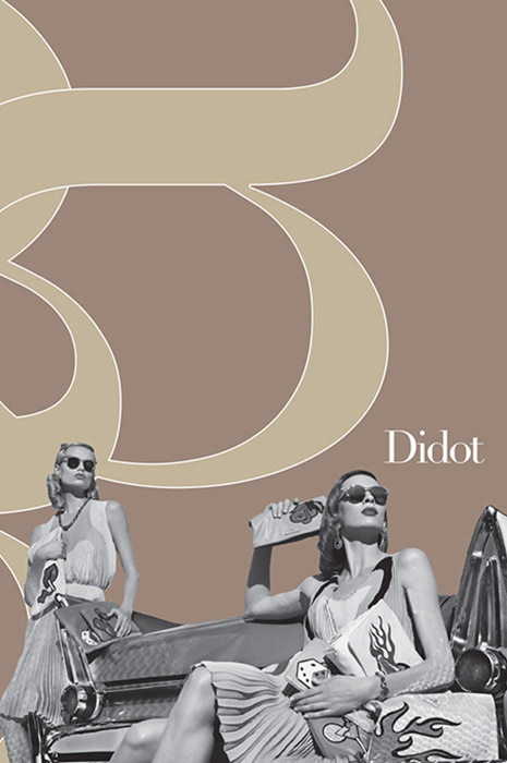
The one thing these poster designs all have in common is the designers' awareness of how to use the type and make it strong. Brianna Repella uses a mix of sans with a display font that mimics a vine. Cullen Mancuso's Spirit Week poster uses all type parts to make the skull. Davina Johnson takes a single, simple character's shape and creates an elegant flow. Emily Crites' Didot mates a fashion photo with a timeless classic font. Knotts King compiles the viewer to look deep into the composition after reading Tschichold's quote. And Samantha Silva sneaks metaphor and symbol into our heads with the visuals but honors what a good poster must do: inform. Typography, typography, typography.
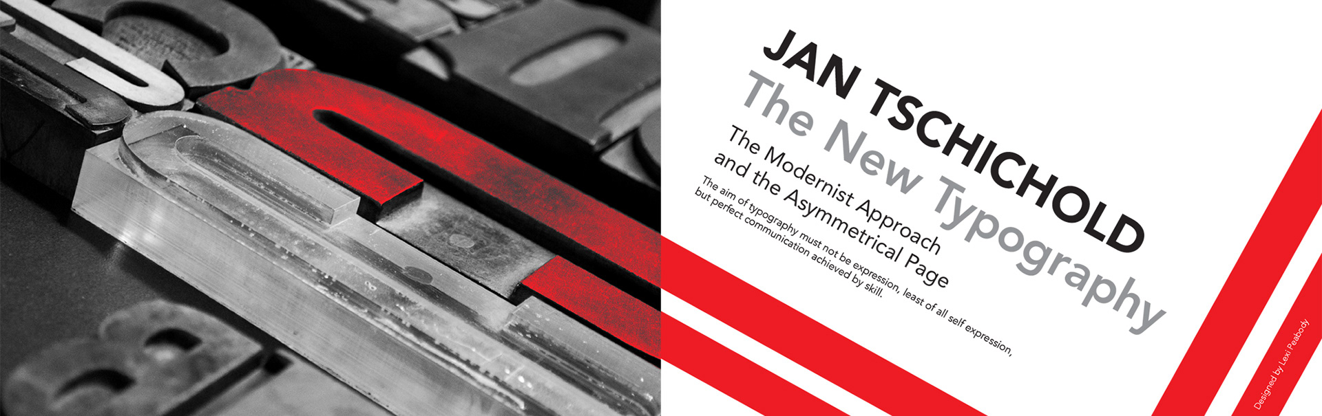
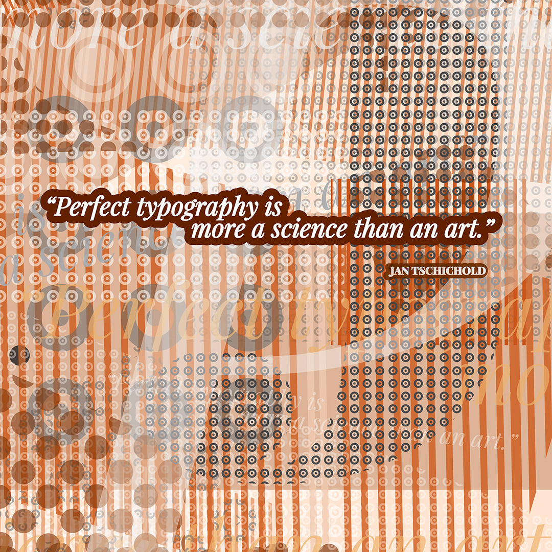
This is a 2-page spread from Alexis Peabody's Specimen Book assignment. What makes it more effective–and her own–is the use of this photograph. She captured a lock-up of type on a press at Lead Graffiti during a workshop. When researching Jan Tschichold and his influence on type's use, it likely occurred to her that what he espoused decades ago was still in use at that present day workshop. Ray Nichols and Jill Cypher have been incredibly generous in their time and materials conducting these letterpress intensives for DCAD's design majors. All of the students that ever attended left with a greater understanding, appreciation and awareness of it's power–and–as Ray says "type has weight."